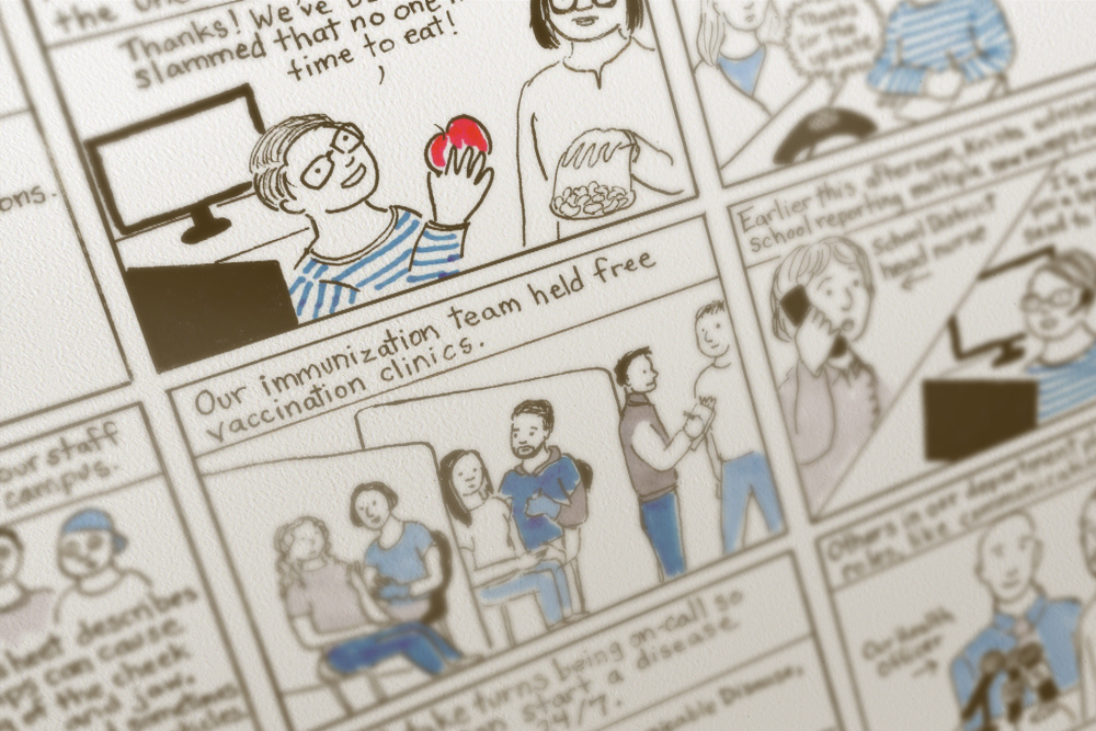
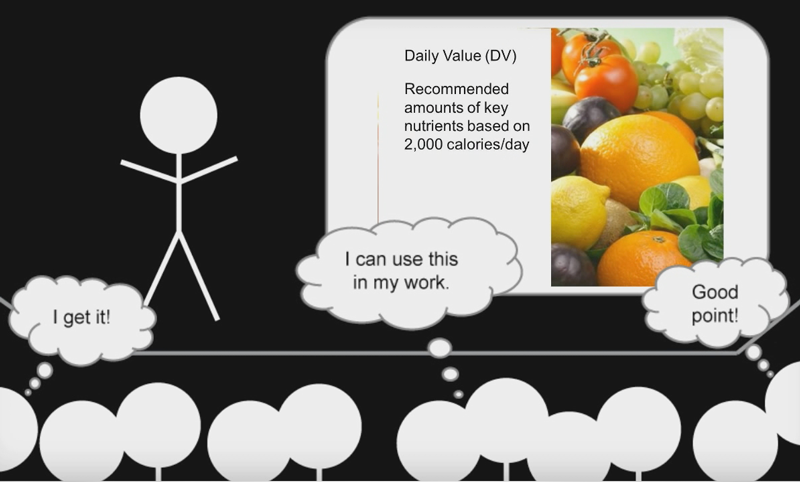
This one-hour webinar, which is part of the Hot Topics series, reviews strategies and inspiration for using data to tell compelling public health stories.
Learning Objectives
- Understand how to identify the most important, relevant, and interesting content to share with an audience.
- Identify appropriate graphic and other visualization techniques given common data constraints.
- Understand how to tailor data messaging and visualizations to an appropriate audience.
- Consider how important design principles are integrated into the creation of presentations and data visualizations to tell a “data story.”
Intended Audiences
Local, state, and tribal public health professionals; communication specialists; epidemiologists
Presenters
Niquette Kelcher, Visual Communications Director, Washington State Department of Enterprise Services
Vonda Witley, Information Design Specialist, Washington State Department of Health
Discussion Questions
- How do you find and create a compelling story from a mountain of data?
- Have you considered: Who is my audience? What do I know about them? How do I create a story for them that resonates and inspires action?
- What is one thing you can do differently or better now that you know the building blocks for developing good data visualizations?
Slides and Resources

Air Date:
Thursday, November 21, 2019, 12:00 pm to 1:00 pm PST
Topics:
Communication
Format:
Webinar
Duration:
1 hour
Cost:
Free
Series:
Hot Topics in Practice
Competency Domains:
Communication Skills


